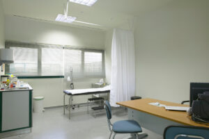
When it comes to designing a healthcare space, colour is one of the most critical elements to consider. Colour can have a significant impact on how people experience a medical environment as well as influence how they feel. We often expect healthcare facilities to choose from a whites colour palette, as we associate that colour with cleanliness and sterility.
However, many interior designers for medical, dental and, office fitouts Brisbane and throughout Australia are choosing colours other than white when decorating. Integrating colour can dramatically change a space and create a comforting and welcome environment for patients and staff alike.
Colour complements the design and although there is no overarching rule to the psychology behind colours (meaning not every colour will evoke a certain emotion in a person), context-specific studies have indicated that there certainly are positive trends.
Healthcare facilities such as GPs offices and hospitals can often be overwhelming environments that cause fear and stress in some individuals. It is important to think carefully about colours and design and the moods you want to create in your practice. When a professional healthcare designer thoughtfully selects a colour palette, this contributes to the wellbeing of individuals in that space, and some extent can be seen as also aiding a patient’s recovery, as different colours possess psychological properties that aid in healing.
Get Your Free Colour Consultation Today
Studies have shown that natural, muted colours have led to positive results in psychiatric facilities, whereas adolescents prefer environments with bright and bold colours that stimulate them. Wayfinding is also a popular concept that has been adopted in many medical spaces, as it is a way of using colour alongside visual imagery and signage to guide people through a physical environment and enhance their understanding and experience of a space.
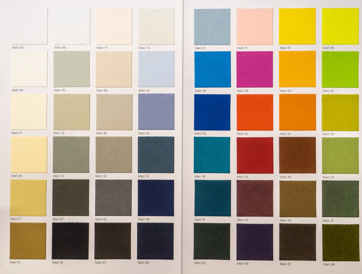
Various areas in medical environments can incorporate specific colour palettes to improve the patient experience as well as the wellbeing of staff and clients. These include waiting rooms and lobbies, patient rooms, and physical therapy centres. With individual settings requiring different colour schemes, how do interior designers go about selecting appropriate colours for a space? Below we’ll detail the various colours that are utilised in the design of a space along with the unique qualities that contrast with one another.
Neutrals
Cream, white, and other neutral colours create an impression of an environment that is pure, clean, and restful. These tones are also noninvasive and will be suitable for any healthcare space, especially intensive care units and consultation rooms, with the latter also incorporating accent colours.
Blue
Symbolising the sea and sky, blue is the most soothing colour choice. Seeing the colour blue can lower blood pressure and heart rate, which in turn allows the body time to heal. In addition to this, blue can also play a role in relieving stress, tension, and other health issues including anxiety, migraines, and insomnia.
Pink
A nice bright colour, pink can stimulate energy and is utilised in certain areas and spaces to reduce erratic behaviour.
Red
Red raises blood temperature and stimulates circulation, so it’s important to not pick this colour in an area where patients need to feel relaxed. It can instead be used in spaces where people are experiencing problems with exhaustion, fatigue, paralysis, and anemia.
Purple
Known for its ability to calm the nervous system, purple is a fantastic colour for promoting spirituality, creativity, and perception.
Earth tones
Grey, beige and brown colours promote a sense of stability and these warm and soothing tones help establish a space as approachable and calming.
Orange
A bold colour that exudes warmth, joy, and energy, orange is a great colour for waiting rooms and paediatric spaces.
Yellow
Although the colour yellow can elicit a sense of optimism and alertness in individuals, it can also cause eye fatigue
Green
Green and blue often feature heavily in setting like operating theatres, as they promote a sense of balance as well as healing and rest. Green also conjures up images of nature.
Turquoise
A gorgeous greeny-blue shade, turquoise is invigorating, refreshing, and relaxing.
Hopefully, this will give you an idea of what sort of colours you can opt for in a healthcare environment. If you need any help with a medical or dental fitout, please feel free to reach out and someone from our friendly team will be happy to assist you.